Kakaotalk Redesign
UX/UI, Problem-solving, TypographyInVision, Sketch, Adobe Illustrator
How can you resolve some of the user pain-points of an app used by 82% of a country?
KakaoTalk has won Korea’s heart with a whopping 41.49 million users in a country of 50.62 million. This app is the whole package – messaging, call, video call, and KakaoStory (Korean Instagram). Having family and friends who avidly use this app, some recurring user pain points have been brought up.
Current UI Design
The current design attempts be customizable, but the app’s lack of organization and haphazard placement of features results in confused users who have to endure an unnecessary learning curve.
Common Qualms:
Common Qualms:
- Crowded navigation bar at the top → Uncomfortable user experience
- Roundabout navigation → Too many ways to access the same task
- Unclear delineation of what features each tab holds → Slower accessibility to desired page
- Brown and yellow colors → Visually heavy

Research
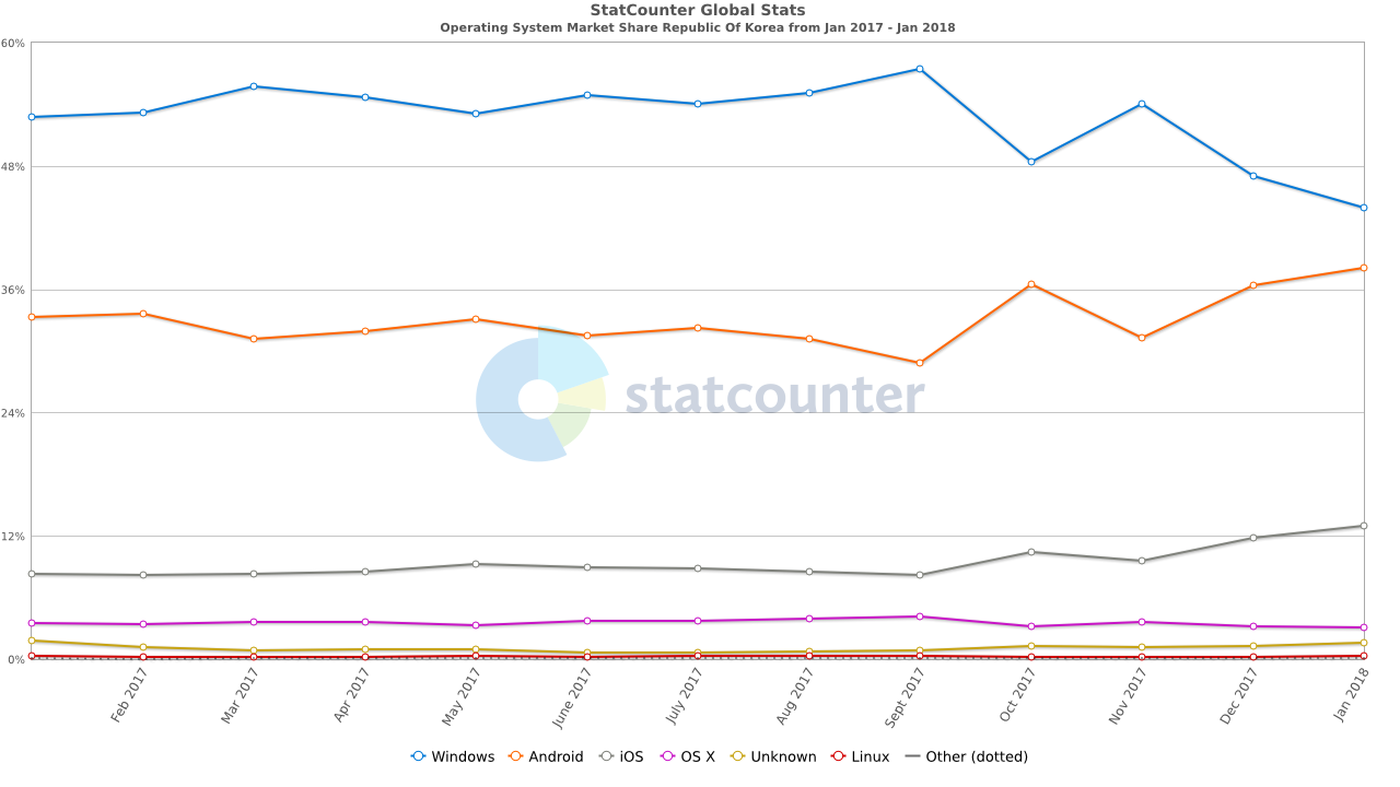
In South Korea, the number of Android users is exponentially higher than iOS users. From this research, I realized that it is more pressing to redesign the KakaoTalk app following Android material design.
Competitors
By researching KakaoTalk’s competitors, such as LINE and WeChat, I saw patterns in popular, useful features, as well as aspects KakaoTalk lacked, in which I reinterpreted to apply to the design.
LINE:

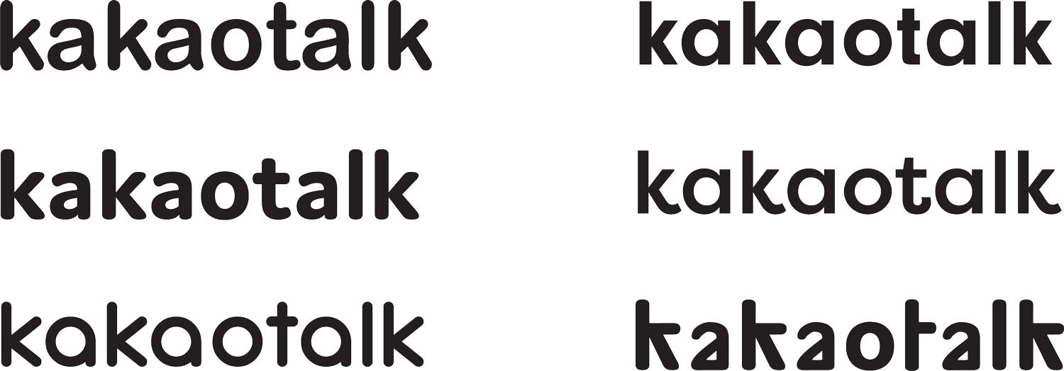
Logo Upgrade
Current Logo
New Logo
Typeface Experimentation:
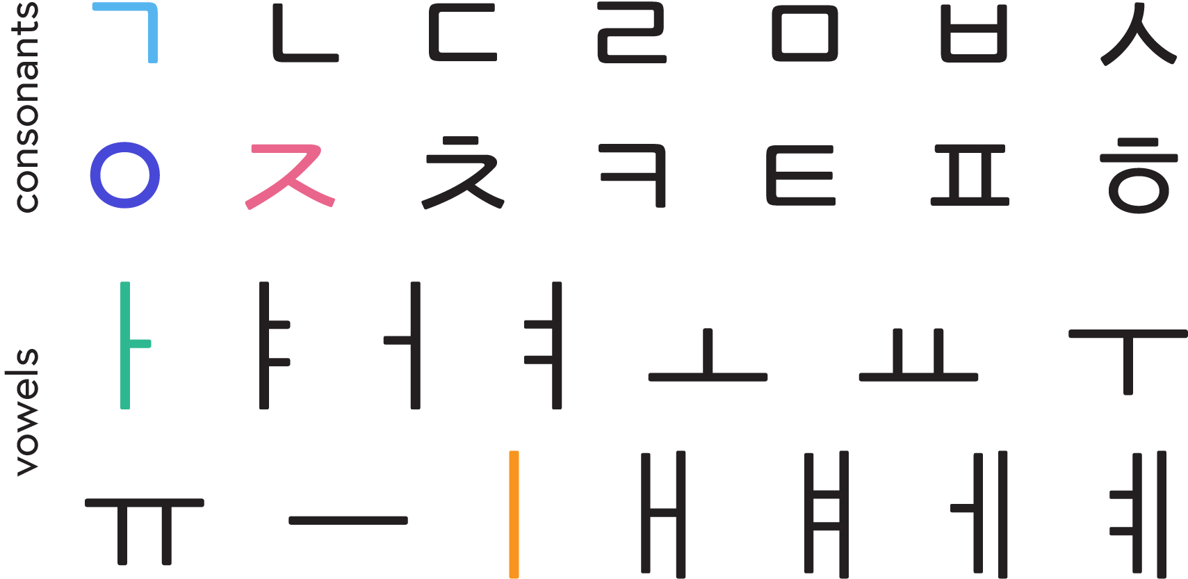
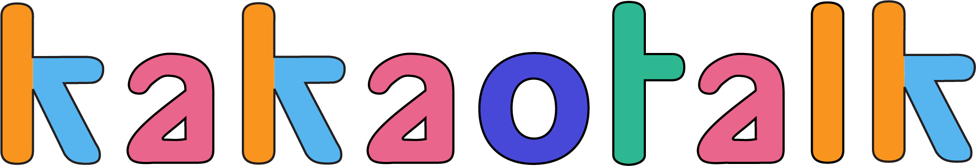
When I was unable to find a typeface that communicated not only the playful side of KakaoTalk, but also paid homage to it’s home country, I decided to create a new typeface that echoed the geometric structure of Hangul, the Korean Alphabet.
The various colors are used to depict which Hangul letter inspired which English letter.
The various colors are used to depict which Hangul letter inspired which English letter.
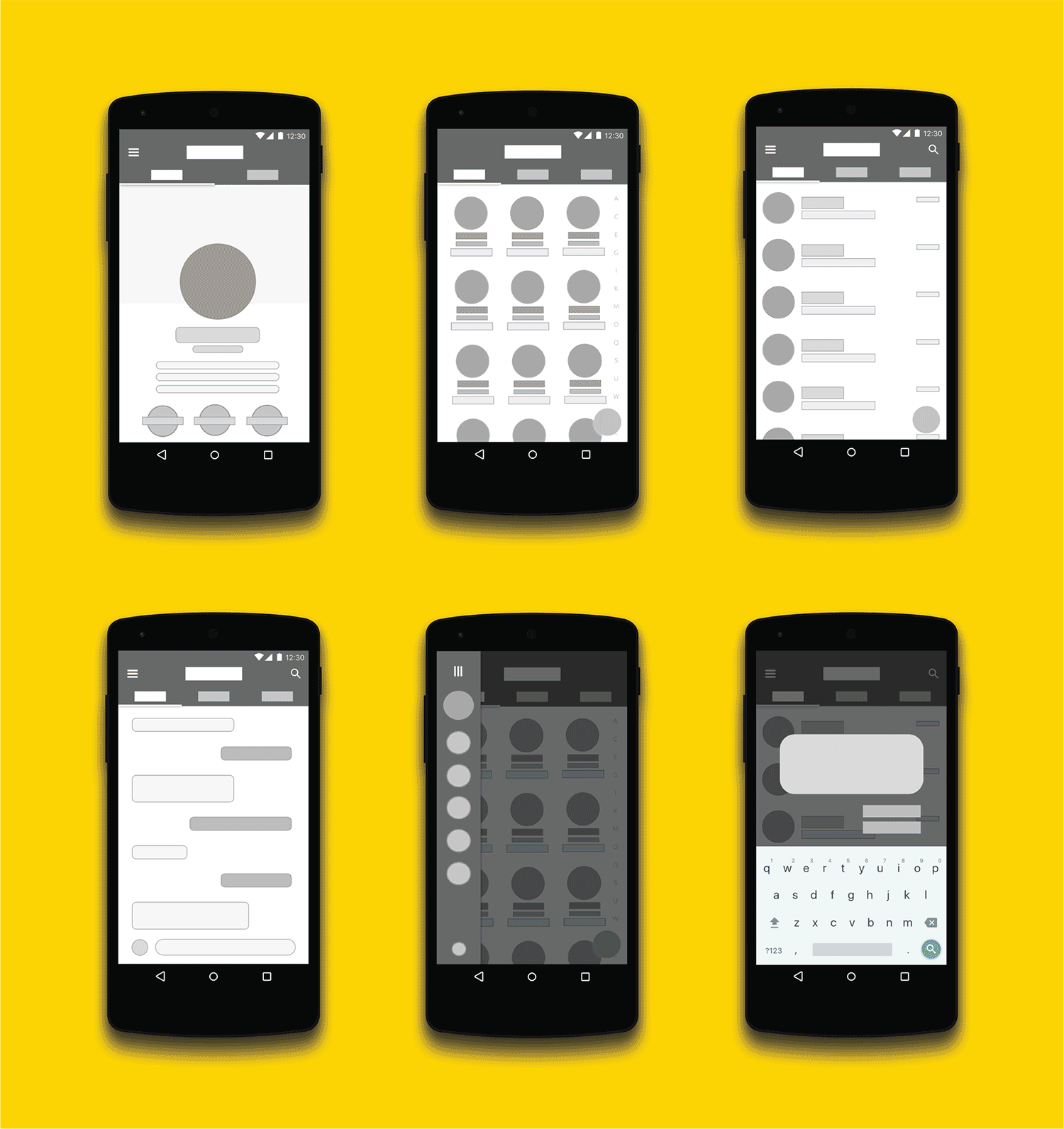
Low Fidelity Wireframes- → Mockups
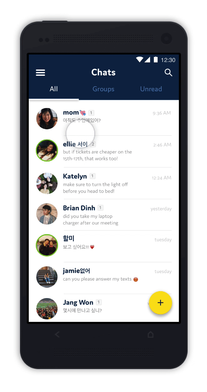
KakaoTalk Redesign Solutions
- Navigation drawer → Contains top-level destinations that are denoted by intuitive icons → easier to navigate
- Tabs → Organizes related content to prevent user from having to search through their Chats, Friends, or Messages
- Typing ellipses → Allows receiver to see when sender is typing
- “Online” feature → Green outline around a profile picture shows that someone is active → encourages and speeds up communication
- New identity colors → Navy and yellow offer a lighter and clearer visual identity
